
Image has always been an important factor in the music industry, from the clean cut charm of Elvis and the early Beatles, to the gritty, leather-clad Ramones and, more recently, Miley Cyrus and Lady Gaga’s extravagant and graphic live shows, the use of image to a band’s marketing scheme and overall success is vital.
Despite the importance of music videos, outfit coordination for gigs and a band logo, I believe that the most important part of image is the album cover.

What intrigues me the most about album covers is the way that they can alter the mood and even meaning of a song by giving it different context. Bright Eyes’ 2005 indie folk album, I’m Wide Awake, It’s Morning is made up primarily of slow, sad ballads such as Train Under Water and Land Locked Blues. Listening to tracks like these on their own would indicate a dark orange or deep blue to me, whereas the felt-cutout, washed out, sepia-tone album cover gives these tracks a bittersweet feeling. (You can click on any of these album covers to see them full-size.)

While the songs and the artwork contrast slightly with I’m Wide Awake, It’s Morning, there’s nothing better to tie the themes of an album together than with an album cover which perfectly encapsulates the atmosphere of the album, such as The Queen Is Dead by  The Smiths, or In The Aeroplane Over The Sea by Neutral Milk Hotel.
While The Queen Is Dead’s dark, high contrast, grainy, and difficult to make out cover flawlessly represents the uncertain and time-bending lyrics, strange and varied production choices and dark sense of humour, which runs throughout the LP, In The Aeroplane Over The Sea’s tea-stained postcard of a cover is a perfect establishing shot for the album, allowing you to view the strange imagery which frontman Jeff Mangum spins over the course of the album which would otherwise be difficult to wrap your head around (“Now she’s a little boy in Spain/playing pianos filled with flames”) in the art style on the cover. Mangum’s friend, Bryan Poole said that “Mangum was always into that old-timey, magic, semi-circus, turn-of-the-century, penny arcade kind of imagery.”

My favourite album covers are the ones which are so full of information that they can be studied, scrutinised, scoffed at and stared at for hours. Two such albums are Kendrick Lamar’s masterpiece, To Pimp A Butterfly (which was one of my favourite albums of 2015) and the cover that it draws inspiration from: The Beatles – Sgt. Pepper’s Lonely Hearts Club Band. To Pimp A Butterfly’s cover depicts a group of black men celebrating over a white judge’s corpse. The cover single handedly supports and visualises every single theme of this album. It’s an incredible ensemble cover which managed to be instantly iconic.

I recently bought Sgt Pepper’s Lonely Hearts Club Band on vinyl, which gave me a great opportunity to study each of the cutouts and see how many I could name. After I was done with the front cover, I opened the gatefold sleeve to discover a guide to all the people who are spliced into the photo.
When I got home, I spent a good chunk of an hour googling each and every name on the list, trying to figure out how each of them could have influenced the fab four. This is the reason that I love album covers so much – they can absorb you, and allow the music to live inside of an image.
It’s difficult to mention album covers without mentioning one of my favorite bands, Radiohead. Frontman Thom Yorke said himself that “If I’m shown some kind of visual representation of the music, only then do I feel confident. Up until that point, I’m a bit of a whirlwind”. Radiohead sleeves have colour schemes which perfectly suit the music itself, such as “bleached bone” for OK Computer. NME have a great article which sums up Stanley Donwood’s (longtime Radiohead artist) creative process between each piece of artwork. A good way to show the unique relationship that the music and artwork have with each other in a Radiohead album is to compare their two most starkly different albums, with three years apart.
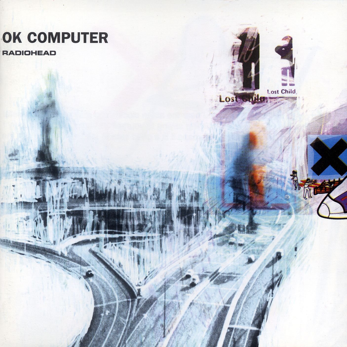
OK Computer is a seminal record which focuses on themes of outward anger at the world, paranoia due to technology, and alienation/isolation. The front cover reflects these themes perfectly, with its unbalanced composition, uncertain, faded images and plane-pamphlet-like illustrations, which all give the album a sporadic and unstable undertone. My favourite aspect of the cover, however, is the ghostly scribbles which litter the cover, once again reinforcing the shaky, paranoid state that the other features establish.

Kid A was a stark change in direction for Radiohead. After the mounting pressure of following up OK Computer got to him, as well as experiencing a minor breakdown, Yorke began to feel sick whenever he picked up a guitar. He retreated inwards, and began to write more self-doubting lyrics instead of outside-world paranoia. The cover of Kid A immediately sets the stage for this synthesiser and sample-dominated album, with the icy, digitally chopped-up mountains being perfect towards the top of the cover, whereas deeper down, there is a layer of distorted and unnatural glitch art, representing the inward anxiety of Yorke’s lyrics.
A lot of album art analysis can seem quite trivial or like over-analysis. After all, if you link two things together, you’re bound to be able to find similarities, or draw parallels. While this is true to an extent, I think there’s one undeniable way to show how much album art can affect the mood of music, how important the colour scheme of a record cover is and that album art is a vital part of a band or album’s image. This is OK Computer and Kid A’s artwork inverted:


Just imagine listening to the chaotic, schizophrenic OK Computer opening track Airbag when looking at the drowsy, slurred oranges of this cover, or listening to the harrowing, macabre, rhodes-driven opener to Kid A, Everything In Its Right Place, when looking at the calming blue sky of the inverted Kid A cover.
Joe Haynes
Related:
Cathays Youth & Community Centre, Studio 22 @ Howardian and Grassroots all have youth music provisions in Cardiff.
Here’s the music section of the new site and the massive archive on the old site.
Check out our Things To Do info section.
Get Involved:
Want to reach thousands of young Cardiffians? Submit your news here or register to become a contributor.
Want to become a reviewer? Join the Sprout Editorial Group on Facebook or email tom@thesprout.co.uk.
The next Sprout Editorial Group Meeting is Thursday 30th June in Cardiff Central Library.